Accessible link text
Published on: 5 March 2025

Meaningful link text
In WebAIM's annual accessibility report of 2024, they found that 13.2% of the top million home pages that they audit, had ambigious link text, such as "click here", "more" or "continue", etc.
This can be a bad thing as users can take links out of context. Imagine seeing something that just said "click here" and not knowing what it was for. It would be pretty much useless. This can be the experience for many users.
How generic link text can impact people
- Any user: who skims a page and who's eyes are naturally drawn to links, may first see "click here" before knowing what it's for. There is then potentially more effort, to associate the link with something, than if the link said what is was for.
- Screen magnification users: may be less likely to see what a link is associated with, if they have a narrower view of a page.
- Screen reader users: can bring up lists of links on a page, so that they can browse pages without consuming all of the page content. Imagine seeing a list of "Read mores", it would be pretty useless.
- Screen reader users: can jump between links on a page. Again, if you jumped to a link that just said "click here", there would then be more effort to work out what it was for.
- Speech recognition users:, such as those using Dragon NaturalSpeaking or Apple Voice Control, for example, can announce something such as "Click read more", to click a link. But if there's 10 "read more" links, this may make that operation harder.
All of this makes sense for links within body text or a link on an article, card or section title, for instance.
The common challenge is where you may have a list of common items. For usability purposes, you may want to include an additional link or button on each item to give a clear path forwards.
In this case you need to consider what the trade offs are between the different approaches available or if there is one approach which is going to be bestest in the universe, for all users.
Example card methods
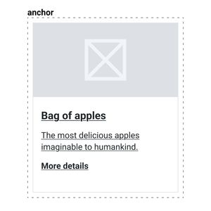
Option one - fairly generic link
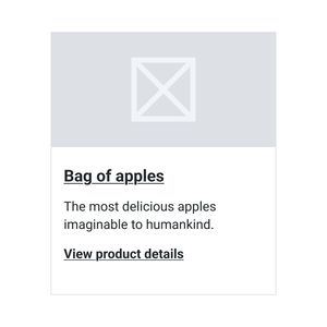
- Pro: link text is marginally more meaningful than something like 'Continue'.
- Pro: title has meaningful link text and can be targetted by voice recognition software.
- Pro: individual links are highlighted, creating a universal experience for sighted and non-sighted users.
- Con: 'view product details' may not meet AAA WCAG standards.
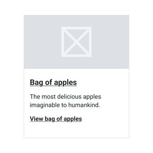
Option two - no generic link text
- Pro: all link text is meaningful
- Pro: would meet WCAG AAA level
- Pro: individual links are highlighted, creating a universal experience for sighted and non-sighted users.
- Pro: title has meaningful link text and can be targetted by voice recognition software.
- Con: depending on the nature of the items listed, it may not always be possible. The varying call to actions could add visual noise which could hamper usability.
Option three - no generic link text
- Pro: all link text is meaningful
- Pro: would meet WCAG AAA level
- Pro: individual links are highlighted, creating a universal experience for sighted and non-sighted users.
- Pro: title has meaningful link text and can be targetted by voice recognition software
- Con: depending on the nature of the items listed, it may not always be possible. The varying call to actions could add visual noise which could hamper usability.
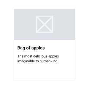
Option four - disconnected generic link
- Pro: individual links are highlighted, creating a universal experience for sighted and non-sighted users.
- Con: some link text is meaningful but not all
- Con: would fail WCAG A
- Con: would fail WCAG AAA
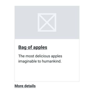
Option five - wrapping card in an anchor
- Pro: card may be more easily clickable
- Pro: would pass WCAG A
- Pro: would pass WCAG AAA
- Con: can result in a mass of text being announced when the card is in focus.
- Con: can result in a mass of text appearing as a link in a list of links.
- Con: can be a disconnect between sighted user experience and assistive techonology experience, if not all the text is visually shown as a link.
- Con: voice recnogition users may struggle to select the card, as may have to announce the enter card contents or use a work around to select it.
Option six - making the wrapped anchor more meaningful
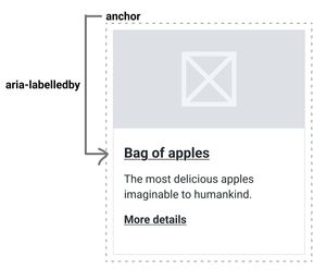
- Pro: card may be more easily clickable
- Pro: would pass WCAG A
- Pro: would pass WCAG AAA
- Pro: avoids the link appearing as a mass of text to assistive technology users, as the link is represented by the title, via the aria-labelledby attribute.
- Pro: voice recognition users should be able to the link via the title.
- Pro: there are strong visual cues
- Con: as it relies on the aria-labelledby attribute, there's no guarantee as to how it may be interpreted across different technologies.
- Con: the sighted experience may differ to the non-sighted experience.
- Con: visual cues aren't always used, in this scenario.
Option seven - as per option six but with less visual cues
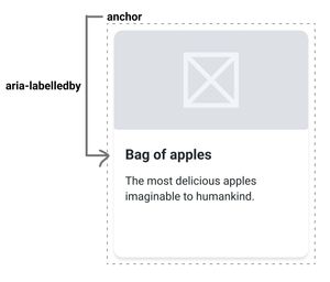
- Pro: card may be more easily clickable
- Pro: would pass WCAG A
- Pro: would pass WCAG AAA
- Pro: avoids the link appearing as a mass of text to assistive technology users, as the link is represented by the title, via the aria-labelledby attribute.
- Pro: voice recognition users should be able to the link via the title.
- Con: as it relies on the aria-labelledby attribute, there's no guarantee as to how it may be interpreted across different technologies.
- Con: the sighted experience may differ to the non-sighted experience.
- Con: visual cues are more subtle, which may not be visible to all users.
WCAG and link text
WCAG 2.4.4 – Link Purpose (In Context) (Level A)
Although it is still best to try and avoid ambigious link text, this guideline suggests that if the surrounding context of the link, gives it meaning, then this is passable.
Consider a 'View article' link which is programmatically contained within an article tag, and that also within that card (or html tag), there is a meaningful heading and description. WCAG 2.4.4 says that this is all good, as users will be able to determine the purpose of the 'view article' link by the related text.
Note, that if you have a 'read more' link, which is in a card that just as a surrounding '
Most of the examples, I've used in this post are associated with using article tags, which would semantically group a link with surround content.
However, it's worth considering that this may not work for all the use cases outlined previously. This may still impact speech recognition users, screen reader users and depending on the design and content length, screen magnification users.
In this context, users may still find ways to work out the page, but they may have to work a bit harder.
If it isn't possible to interpret the meaning of the link, based on its context, it could still fail this guideline.
WCAG 2.4.9 – Link Purpose (Link Only) (Level AAA)
If you want to avoid the potentially negative interaction, implications, of having generic links, then this guideline is essentially saying that the links always need to be meaningful.
If you want to follow this guideline, you simply need to destroy all generic links.
WCAG shortcomings
As I understand, these guidelines only apply to links, and not buttons, for example. So you could pass WCAG, having generic 'click here' buttons, but users with assitive technologies could still encounter some of the usability issues, with this method, outlined previously.
Also, most people normally aim for AA standard. Meaning that there's still plenty of scope to have generic call to actions on things like cards.
Visible underlines or buttons
There isn't anything in WCAG to suggest that your text links must have underlines or that clickable cards, for instance, must have an underlined link or button. However, there are a number of usability considerations, to make.
- Colour alone: WCAG states that you can't rely on colour alone, to communicate information. If a link is in some body text and is just coloured differently, but without an underline, this would be a fail WCAG.
- Cards as links: consider if all users would understand that a card is clickable, including those who have lower computer literacy. Often usability testing is conducted on users with fairly high computer literacy standards so may not always paint the full picture.
- Cards with drop shadows: consider if any visual ques to indicate that a card is clickable, such as using a drop shadow, would still be visible to users with visual impairements.
- Universal design: consider which solution will work best for all users, minimise cognitive load and maximise confidence.
Conclusion
- In body text, always try to use meaningful link text.
- Where it is trickier to use meaningful link text without jeapordising other usability benefits, there are some options to consider.
- The key is to consider how a range of users may interact with your feature. People using a keyboard, screen reader, voice recognition or magnification software. Or people who have low computer literacy, are partially sighted and so on.
- Given the range of needs people can have, robustness, simplicity, user centricity, usability and content shouldn't be sacrificed for aesthetics.
In the article, I've outlined the pros and cons of each approach. It is worth noting that options one, two and three, potentially have the least number of negatives, associated with them.