Colour contrast
Published on: 12 March 2025

A common problem
Have you ever squinted at fluorescent yellow Comic Sans on a Powerpoint presentation? I hope you haven't been subjected to this, but the chances are, that you have experienced poor colour contrast, in your every day life, at some point.
Despite advances in the user interface design space, colour contrast is one of the most common digital accessibility issues, according to WebAIM.
In fact, based on WebAIM's statistics, you could say that colour contrast is criminal number one, on the most wanted list of accessibility fails.
81%, of the million sites that they audited, using automated checks, had colour contrast issues on their home pages.
This hasn't reduced much in the last 5 years.
Poor contrast can impact a number of people
- Anyone: using a phone on a sunny day
- Two million people are living with sight loss in the UK.
- One in five people will live with sight loss in their lifetime.
- One in twelve men are colour blind.
You could theorise that combining the figures, that poor colour contrast could impact around 7% of the UK. Yet this is ignoring situational and temporary impacts, which could equate to a much higher percentage.
WCAG and colour contrast
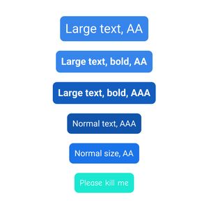
- Normal text: Must have a contrast ratio of 4.5:1.
- Large text (24px or bold 18.66px and larger): Needs at least 3:1 contrast.
- UI components (buttons, links, icons, form fields): Should have 3:1 contrast.
- WCAG AAA has higher thresholds for contrast levels.
- WCAG's definition - Contrast (Minimum) (Level AA)
Thankfully, there's plenty of freely available tools that allow you to check different colour combinations.
Contrast issues on graphics
If you have a graphic, whereby the contrast between the text on the graphic and the background, this would still be a WCAG fail.
The rule states 'The visual presentation of text and images of text...'.
W3C also explitly call out this example as a fail in their guidance documentation about the rule.
Contrast checking tools
Figma plugins
- Axe plugin lets you scan entire 'frames'.
- Stark lets you select different elements to check or use a colour picker.
- Stark lets you generate a number of colour blindness simulations to check if the design is still usable, with the simulation applied.
- Stark lets you monitor figma files.
Automated browser scanning
You can run automated scans in a browser to find errors.
- Axe
- Lighthouse
- WAVE
- Browserstack
- Likely many others
Mass scanning and monitoring
There are tools which will let you monitor 100s or 1000s of pages in bulk. Colour contrast, being one of the potential automated errors that they may pick up.
- Deque (who create Axe)
- Stark
- Browserstack
- Likely many others
Limitations of automated tools
Sometimes automated tools don't pick up on text over an image background that may fail contrast checks.
Tools won't pick up on graphic content, where text is part of an image.
Development and testing stages
Work automated checks into development and testing lifecycles to add additional safeguards. Common frameworks like Axe or Lighthouse can be integrated into source control and testing processes, as well as the browser checks that anyone can do.
When reviewing designs, speed up your review process by using the tools that can scan whole frames or files.
Native app testing
- Android Accessibility Scanner
- Android Studio
- Apple’s Xcode Accessibility Inspector
- Browserstack's accessibility testing suite
- Deque, axe DevTools Mobile
Do's and don'ts
- Do: create design systems to create a compliant set of re-usable colours.
- Do: define and communicate colour combinations, not just colours themselves.
- Do: run automated checks at every stage of the end to end design, development, testing and monitoring lifecycle.
- Do: ensure borders on things like input fields pass.
- Do: ensure icon based buttons pass
- Do: use browser and figma emulators to experience how an interface may display for different people.
- Do: the gold standard would be to test your interface out on people with a range of conditions.
- Do: consider how colour can impact a range of disabilities, such as forms of autism, dyslexia and ADHD.
- Don't: rely on colour alone to communicates meaning.
- Don't: sacrifice usability and meaning for aesthetic colour choices.
- Don't: rely solely on automated checks as they may struggle in image based contexts.
The evolution of contrast definitions
The Advanced Perceptual Contrast Algorithm (APCA) may replace the current method and definitions of comparing contrasts in future iterations of WCAG but has not yet been fully validated or confirmed by W3C.
Therefore, until W3C fully accept it into the WCAG guidelines, the safest bet is still go by the current definitions, outlined by WCAG.
However, this is an emerging space and will be great to see if advancements are made in this space.
Conclusion
Everyone perceives colours differently and it's also hard to account for every setting a user may be in.
The key is trying to strike a happy balance and allowing browser, device and assistive technology customisation, so that users can adjust the colours to their unique needs, where needed.
Whilst there are mixed views on the impact of dark mode for instance, it can benefit certain users, in certain situations. So enabling things like dark mode, for the users who do feel that they benefit from it, is beneficial.
One colour contrast issue can lead to 100s or 1000s of error instances, when running automated tools. Therefore, it is easy to imagine that this could impact search engine algorithms or increase various legal and legislative risks.
Colour contrast is a relatively easy issue to resolve and has a broad user benefit.
Sources and further reading
Sources
Further reading
- WebAIM have a pretty detailed breakdown of WCAG colour considerations