Keyboard accessibility
Published on: 19 March 2025

What's the point
Have you ever tried filling out an online form, only to realise you need to constantly switch between your mouse and keyboard? Frustrating, right? Now imagine if that was your only way to navigate a website, how much harder would it be?
Keyboard accessibility creates a more efficient user experience.
This can benefit commercial goals by increasing completion rates.
As with most accessibility considerations, the impact to the end user is on a sliding scale. For some, it increases efficiency, whereas for others, it is a fundamental pre-requisite, for being able to use a website.
- Keyboard accessibility benefits all users
- It can lead to more semantic HTML that can benefit non-keyboard users too
- Advanced users may opt for keyboard use
- Using a keyboard to navigate, can be more efficient
- Task efficiency can have commercial benefit
- Broadening market reach can have commercial benefit
- It's a WCAG requirement
Tab sequence do's and don'ts
- Use semantic HTML so actionable elements are naturally keyboard accessible
- Ensure the focus state is visible so people know what they're interacting with
- Use a focus style that is visible on any background
- If using a non-standard HTML element, use tabindex='0', so users can tab to it
- Shift focus into modals
- Use escape to close modals, dialogues or popovers
- Trap focus in modals
- Tabbing past the last element in a popover, closes the popover
- Don't include non-interactive elements in the tab sequence
- Avoid creating custom tab sequences
- Users shouldn't be able to tab to elements that aren't visible
- Avoid empty links as these won't be tabbable
- Watch out for keyboard traps where each time you try to get past a certain point, you're looped back to the start
Why it's easy to implement
It's easy to define basic keyboard requirements for any piece of development. For example:
- It should be possible to use the page/feature/component with a keyboard alone.
- The tab sequence should be in a logical and sequential order.
- You should be able to tab to any actionable element.
In certain cases, more detail may be required for complex features, where arrow keys or specific use of the spacebar, escape or enter keys are needed.
WebAIM outline some standard keyboard behaviour for common HTML elements.
It can be useful sometimes to refer to default HTML behaviour such as using W3 schools, if clarity is needed on how to test against certain elements.
You could also use chat GPT to generate some basic code snippets, to get a feel for how something could be interacted with, with a keyboard.
But on the whole, the baseline criteria should cover most cases, and is relatively easy to test against. Everyone has a keyboard right?
What should you be able to tab to?
You should be able to tab to any object that is actionable, such as:
- Buttons
- Form fields
- Navigation
- Links
Essentially anything that you can click on.
It is common practise to ensure that users can't tab to disabled elements, to help indicate that the feature can't be actioned.
What a focus state is
If you try pressing the tab key on a site which should be accessible, such as RNIB or Gov UK, you'll see that the element which you are 'focussed' on, when you tab, will have an indication that it is in focus.
There are browser default focus state but these may not always be as robust, against various background colours, compared to defining your own.
Techniques are available to ensure a focus state always stands out, such as using a two colour focus state.
The focus state, essentially indicates where you are on a page.
It's a WCAG guideline.
Differences with screen reader behaviour
Whilst screen reader users may also tab between objects, screen readers also have their own navigational keys.
A screen reader user will need to be able to access non-interactive elements which are outside of the tab sequence.
There can be confusion between 'focus order'/'tab sequence' and 'reading order'.
- Reading order is the order in which a screen reader user should be able to consume the content in. This will contain both actionable elements and other elements (like headings or chunks of text etc)
- Focus order or tab sequence is the sequence in which you can tab between actionable elements.
Annotating reading order
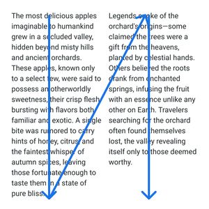
Often reading order is pretty selef explanatory, but where extra clarity is needed, reading order is often annotated using directional arrows, on a design. This is the order in which a screen reader should navigate through a series of objects. Some may be interactive, others not.
It does not indicate that everything would be read out in one go. It is an indication of screen reader sequencing, which is different to tab sequence.
Annotating focus order
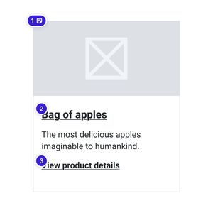
This shouldn't indicate that there will be a forced tab sequence using tab-index overrides.
The intention is to give clarity as to which elements are interactive, and help indicate the logical tab sequence.
This isn't strictly necessary to annotate, but can sometimes help give clarity as to which elements are interactive and to hammer home the keyboard access requirement.
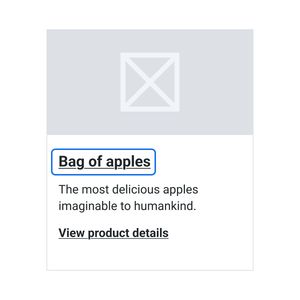
Annotating clickable areas
Often it can be beneficial to group elements into singular objects. This is most common in native app design where screen reader controls are more basic, but also applies to simplifying keyboard sequencing.
Annotating clickable areas also helps indicate touch target size, to ensure things are easy to click and where minimum touch target sizes is a WCAG requirement.
In this example, if a the label, checkbox and helper text are treated as one object, it would effectively act as one tab stop.
This can make the experience more efficient for users. I have often found this annotation method to be the most useful.
Annotation plugins
Various plugins accomodate defining reading and/or focus order. Such as Stark, Axe and Ebay's 'Include – Accessibility Annotations' plugin. But really any kind of annotation method can do the job.
Don't over engineer tab sequence
If semantic HTML tags are used, such as 'buttons' for buttons, then nothing else is needed to ensure that the element is in the tab sequence of the page.
If a non-standard HTML element is used, you can simply define "tabindex='0'".
Forcing a set tab index isn't normally necessary and would likely be prone to misalignment from the visual sequence.
Testing keyboard interactions
- Manually test, with a keyboard.
- Some tools, such as Browserstack, offer semi-automated or assisted testing methods.
- Automated checks may pick up empty links, which can cause issues for keyboard access.
Common patterns
It can be useful to look out for a few common scenarions:
- Ensure keyboard users can access modal or dialogue content
- Modals and dialogues should trap keyboard users until the modal or dialogue is dismissed to prevent the user accidentally ending up on content outside of the modal or dialogue which could be disorientating
- For 'popovers', often used for navigation, for example, it can be useful for the popover to dismiss, as the user tabs past the last actionable element in the popover, opposed to a modal which traps the user
There will of course be more examples but resources can be found online where people have disected interactions with things like tool tips and auto-suggest boxes etc.
Conclusion
Keyboard accessibility is one of the easiest enhancements you can make to ensure your end product is inclusive.
Afterall, most designers, developers and testers have a keyboard.
Keyboard accessibility leads to a more robust solution that covers off various accessibility facets that can be impactful, when it comes to the experience of your end product.
Try navigating some websites with just a keyboard and see how you get on.